

The Inception of Dotting and Diacritics in Arabic Posted by Ibnulyemen اِبْنُ اليَمَن on Aug 17, 2017 in Arabic Language, Pronunciation
During the early days of Islam, Arabic scripts had neither dots nor diacritics. As illustrated in the Table (1), a word with neither of these typographic features had multiple meanings. Figuring out what it meant depended primarily on Arabs’ intuition, memory, and the context. By the time of fourth Caliphate, Imam Ali ibn Abi Talib, large influxes of non-Arabs embraced Islam. Due to the linguistic differences between their native languages and Arabic, mispronunciation became prevalent. Deemed hideous, mainly while reading and reciting the Holy Quran, erroneous pronunciation had to be urgently repaired.
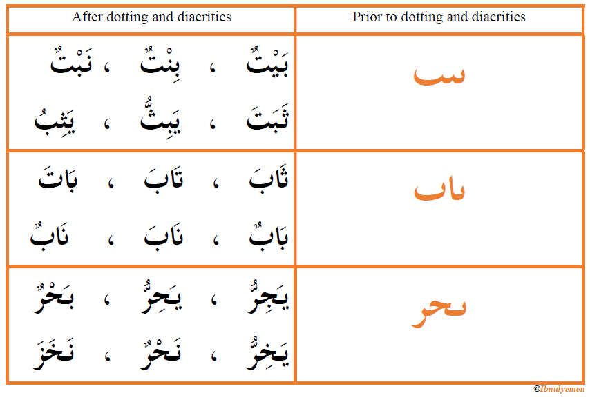
Table (1)
Consequently, it was pressing that rules and regulations be established to repair errors in articulation to rid of ambiguity and improve comprehensibility of speech of new Muslims whether in reading and reciting the Quran or daily communication. Diacritical marks, namely fatHah, Dammah, kasrah, and sukoon, which had slightly different shapes than is the case today, were introduced. As well, dots above or below certain letters had to be employed to lessen resorting to intuition and context in deciphering what similar letters stood for.
The introduction of diacritics was known as شَكْل shakl, the verbal noun of the verb شَكَلَ shakala ‘to tie’. In modern Arabic, it is always referred to as تَشْكِيْل tashkeel, the verbal noun of the verb شَكَّلَ shakkala ‘to assign diacritics/to shape in a particular way.’ Put simply, shakl meant tying letters with diacritics (i.e. short vowels) so that they are pronounced in a certain way.
Dotting was known as إعجام i‘jaam, the verbal noun of عَجَمَ ‘ajama ‘to rid of the ambiguity of letters via dotting.’ For instance, the shapes of ب, ث, ت, ن, andي is the nearly the same, especially word-initially and -medially; so are those of ج, ح, and خ. Essentially, what differentiates them from each other is the presence or absence of dots as well as the position of the dots, as illustrated in Table (2).
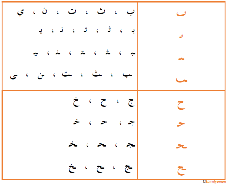
Table (2)
As you probably know, there are other letters that have the same shape. The only way to differentiate between them is through the usage of dots. These are د ذ ، ر ز ، س ش ، ص ض ، ط ، ظ ، ع غ ، ف ق. Just imagine how knotty it had been for native-speakers to guess what a word containing two dotless letters ق + ط mean, let alone non-natives. It can be قِطّ ‘cat’, فَظّ ‘rude’, or قَظَّ ‘to annoy’.
History of shakl
Prior to employing it with Arabic, shakl was used with other languages, namely Syriac and Hebrew. When the Syriacs embraced Christianity in the fourth century AD, they had to translate the Bible into their language, and to ensure accuracy in reading it, they had to use dotting, specifically they used big dots above and below some letters.
In Hebrew, it is reported that the Jews, in the fifth and sixth century AD, initially used certain letters above or below others as a means of restricting pronunciation. Owing to its impracticality (i.e. increasing the number of letters in each word), this system was supplanted by another, that is the usage of dots above and below the letters.
As to Arabic, since Arabic scripts is derived from Nabataean Aramaic scripts which had no dots or diacritics, there is a strong likelihood that the Arabs mimicked the Syriacs or the Jews given that some Muslims spoke Syriac and Hebrew since the time of the Prophet. Even though some historical accounts narrate that Arabic dotting and system of diacritics were introduced during the Umayyads, some argue that they were used by the companions of the Prophet and the Holy Book of Islam included diacritical marks at the time.
Development of dotting and diacritics
Abulaswad al-Duali, a companion of the fourth Caliphate, is said to be the first person to introduce diacritics based on the movement of his lips as he was reciting the Quran. For spreading the lips, al-Duali suggested a dot above the letter, a dot below the letter for lowering the lower lip, and a dot right on the letter for rounding the lips. These dots represent fataH, kasrah, and Dammah of today, respectively.
Later, disciples of Abulaswad proposed three distinct shapes for dotting: a small empty circle, a small shaded circle, and a small rectangle. Also, they came up with a symbol for the shaddah, that is an arc placed on or below the letter. For a letter with shaddah and fatHah, an arc with its head upward, like this ᴗ, is placed on the letter; an arc like this ᴖ below the letter indicates shaddah with kasrah; and one like this ᴖ on the letter indicates shaddah with Dammah.
While there was consistency in using dots and shapes in all Muslim regions at the time, coloring of these symbols varied from one area to another. In Iraq, red color was used; in Madinah, red was used for dots and yellow for shapes. In Maghreb, they copied the Madinah system, yet in the nearby al-Andalus they used four different colors, namely black, red, yellow, and green.
Abulaswad’s method continued to be in use throughout the Umayyad era. During the Abbasid Caliphate, to ease the job of copyists and transcribers, it was proposed that coloring of the Quran be ceased. Owing to certain similarity of the dotting and diacritical system, a new method had to be improvised. This was resolved by al-Khaliil ben Ahmed, a leading Arabic linguist of the time.
Al-Khaliil proposed that diacritical marks be in shapes of letters. Therefore, Dammah was represent by a small waw و to be placed on the letter; fatHah was represented by a small tilted alif placed on the letter; and kasrah was denoted by a small yaa’ يـ under the letter, which eventually lost its dots and became a small tilted alif placed under the letter. These are the diacritical marks that we use today.
Al-Khaliil also proposed a small zero-like symbol called sukoon to indicate the absence of a vowel with the letter. For shaddah, he employed a small shiin شـ, which is taken from the word شَدَّة (i.e. the first letter). It was practical to strip of the dots of شـ, so it eventually become سـ as we see it today. He also used small Saad صـ for wasl and small ‘ayn عـ for qaT‘ , both are still being used in Quranic writings.
As for lettering, Kufic form of calligraphy was the most popular during both the Umayyad and Abbasid eras. A post will be dedicated to Arabic Calligraphy at some point.

Build vocabulary, practice pronunciation, and more with Transparent Language Online. Available anytime, anywhere, on any device.

About the Author: Ibnulyemen اِبْنُ اليَمَن
Marhaban! I am from Yemen. I am a language teacher. I teach English and Arabic. In this blog, I will be leading you through Arabic language learning in a sequential fashion. I will focus on Modern Standard Arabic. To learn more, you can also visit my website Ibnulyemen Arabic or my facebook page.