

How and Why To Write The ß in All Caps In German Posted by Sten on Oct 10, 2019 in Culture, Language
If you’ve been learning German, you’ve probably come across the weird symbols in German. From the Umlauts ä, ö, ü to the Eszett (ß). When it comes to großschreiben (capitalizing) these special symbols, it’s pretty easy with the Umlauts: Ä, Ö, Ü. But the ß? There’s more of a story than you might think! Let’s dive in.
First of all, what would we even call this thing? In German, you can call it:
das große ẞ
das große scharfe S
das versale ß
das große SZ
das große Eszett
ß-Majuskel
Quite a list. They all just come down to a big ẞ. So we’ll simply call it großes ẞ in the following.
So what happened to this großes ẞ, and why is it even worth writing a post about?
A Streit About Nothing?
#/media/Datei:Reichstagseröffnung_1912.jpg)
A Plenarsitzung (plenary session) in the German Reichsparlament (Reich Parliament) in 1912 (Image public domain, from Commons.wikimedia.org)
For more than 2 Jahrhunderte (centuries), Germans led a Debatte (debate) about the Schrift (script) of the German language. There were those pleading for the ungebrochene Schrift (unbroken script) Antiqua, and the gebrochene Schrift (broken-up script), in Germany also known as Fraktur. Fraktur consists of the typical ornate blackletter typefaces typical of the early Buchdruck (letter press). Antiqua, developed in the 15th Jahrhundert, only became more popular in Germany in the 18th and 19th Jahrhundert.
The difference between gebrochene and ungebrochene Schrift lies in how the roundings of the letters look. Compare the u and the t below. The lines of the u are “broken up” where the lines of the letter bend in Fraktur. In Antiqua, the lines follow a round shape, they flow – hence ungebrochen. Fraktur also uses more ornate capital letters, compare the F and the A in the two words.

Fraktur, written in the Fraktur font style (Image by Manuel Strehl at Commons.wikimedia.org under license CC BY SA 3.0)

Antiqua, written in the Antiqua font style (Image by Manuel Strehl at Commons.wikimedia.org under license CC BY SA 3.0)
The Streit was about aesthetics, nostalgia and nationalism. Fraktur was not used much elsewhere in Europe, and so it is sometimes referred to as “German script”. Foreign works, especially the influential French stuff from the Aufklärung (Enlightenment) era and works coming after the French Revolution, were set in Antiqua. In 1911, this Streit peaked when the German Parliament hotly debated whether to adopt Antiqua or to stick with Fraktur as the official German font. Antiqua lost narrowly by 85-82.
And so the Streit quibbled on. Until we arrived at a strange moment of history in 1943: one of the worst people that ever lived actually ended a dispute!
You see, when the Nazis occupied territories outside of the German-reading world, they also exported their Schrift. Which was Fraktur! The people in occupied territories were often used to Antiqua, and so that German stuff was simply hard to read. Joseph Goebbels, Hitler’s propaganda minister, wanted to publish the Wochenzeitung (weekly paper) Das Reich. A paper made for people in occupied lands, too. And to make sure the intended audience would actually read it, he set it in Antiqua.
In 1941, then, Hitler made the decision that not only material intended for foreigners was going to be set, but everything!
Unsurprisingly, Hitler blamed the Jews for Fraktur. He said Fraktur consists of Schwabische Judenlettern (Swabian Jew letters), which is entirely made up. Fraktur was invented by Christians. But it gave him a convenient scapegoat.1Hitler himself also disliked the gothic-inspired Fraktur. According to Hitler, it was not fitting for a time of iron and steel.

The German Apotheken (pharmacies) use a Fraktur “A” as their logo to this day (Image by Concord at Commons.wikimedia.org under license CC BY SA 4.0)
Anyway, from then on, Antiqua was to be the Normal-Schrift (normal script)! And slowly, but surely, Fraktur largely disappeared from Germany.2It is now really a remnant of past times, an artifact of German history. Some Fraktur fonts are even specifically seen as being Nazi fonts.
How did we get the große ẞ?
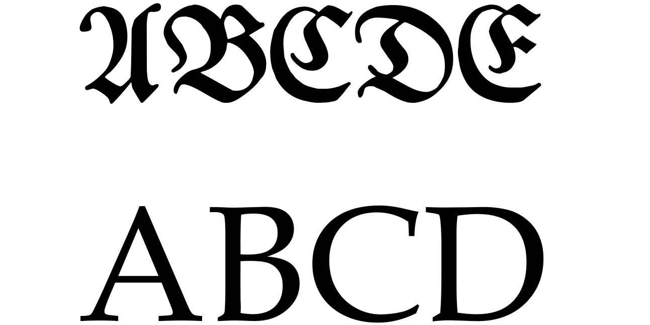
Majuskelschrift in Fraktur (above) and Antiqua (below) (Image by author)
So that tangent about the Streit between Antiqua and Fraktur actually matters for our großes ẞ. Normally to highlight a certain part of a text, you can put it in Majuskelschrift (all-caps script). However, with the ornate Großbuchstaben (capital letters) of Fraktur, you couldn’t really do that. So in the Fraktur times, it was conventional to use Sperrsatz (spacing) to highlight text.
But you see, then Antiqua became more popular. Which actually allowed you to use Majuskelschrift.
And that’s all fine. But here’s the thing:
German words have never began with a ß. So a Großes ẞ was never necessary with Fraktur. But then Antiqua came around, and even became normal in Nazi times and beyond.3There was a Streit too about introducing the große ẞ that started at the end of the 19th century. What to do when you write a word like Straße in all caps?
Of course, we stritten (fought) about that, too.
It began at the end of the 19th Jahrhundert. Shouldn’t we introduce a große ẞ into the German language?
Well, we didn’t for a long time. And during that time, a großes ẞ was written either as the regular ß (STRAßE), more commonly with double S (STRASSE) or, where SS would be confusing, with SZ (STRASZE).
That was the rule for a full century. In 2006 then, with the neue deutsche Rechtschreibung (new German spelling rules), it simply became:
Bei Schreibung mit Großbuchstaben schreibt man SS
(When writing a capital letter, one writes SS).
Why? Simply because the board that sets these rules doesn’t simply invent new symbols, they said.
But the development took up steam, and in the reform of 2017, the above became the following:
Bei Schreibung von Großbuchstaben schreibt man SS. Daneben ist auch die Verwendung des Großbuchstabens ẞ möglich. Beispiel: Straße – STRASSE – STRAẞE.
(When writing a capital letter, one writes SS. Furthermore, using the capital letter ẞ is possible. Example: Straße – STRASSE – STRAẞE.)
So we have a large variant of the ß in the German Rechtschreibung (spelling rules) now!
How to write the ẞ?
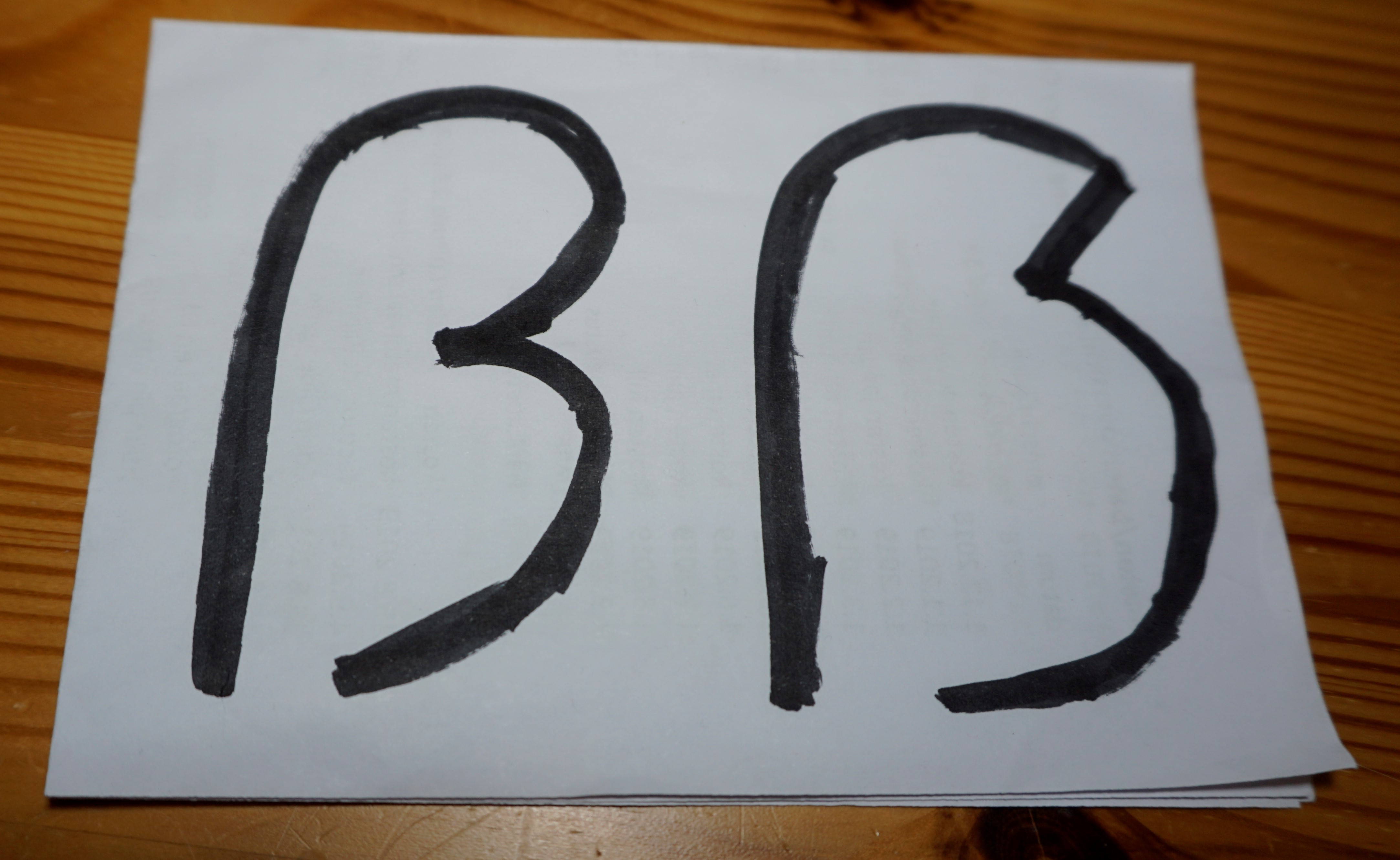
A normal ß left and a capital ẞ right (Image by author)
The difference between the ß and the ẞ is that the große ẞ is in line with the height of surrounding Großbuchstaben, and it is a bulged version of the normal ß.
Depending on the font, the große ẞ even adds in a little Fraktur-flair, by breaking the upper curve. Like in the picture above. I recommend doing this when writing by hand, since it really sets the small and capital letters apart.
How to write it in a word processor?
You can either use the numpad combination, holding ALT and typing 7838 on your numpad, and releasing ALT.
If you don’t have a numpad, you can always resort to the quick and dirty copy-paste by searching it online.
Or, if you have a German keyboard, you can get there with a key combination (on Windows, that is).
Normally, you get a capital letter by holding SHIFT and typing the letter. On German keyboards, holding SHIFT and typing the ß gives you a ?. Not what we want. When holding SHIFT + ALT GR + ß, you get the ẞ!
Have you used the großes ẞ before? What do you think about writing it big like this, or do you prefer the SS variant? Let me know in the comments below!
- 1Hitler himself also disliked the gothic-inspired Fraktur. According to Hitler, it was not fitting for a time of iron and steel.
- 2It is now really a remnant of past times, an artifact of German history. Some Fraktur fonts are even specifically seen as being Nazi fonts.
- 3There was a Streit too about introducing the große ẞ that started at the end of the 19th century.

Build vocabulary, practice pronunciation, and more with Transparent Language Online. Available anytime, anywhere, on any device.

About the Author: Sten
Hi! I am Sten, both Dutch and German. For many years, I've written for the German and the Dutch blogs with a passion for everything related to language and culture. It's fascinating to reflect on my own culture, and in the process allow our readers to learn more about it! Besides blogging, I am a German-Dutch-English translator, animator and filmmaker.
Comments:
Adam:
Very interesting perspective on the history of this letter, especially the struggle between the two typefaces.
Michael Q.:
You’d think a letter called Eszett (SZ) would always be substituted by sz and not ss. But if it were that simple, it wouldn’t need a blog post!
Sten:
@Michael Q. Right?
I think “sz” throws people off in pronunciation, since the ẞ is always pronounced as an S with a stress, basically.
But yeah now you know! SS or ẞ 🙂
Thorsten:
Streiteten? That word does not exist. The correct impferfect of streiten is “stritten”
Ich stritt, du strittest, er/sie/es stritt, wir stritten, ihr strittet, sie stritten.
Streiten – stritten – gestritten
Sten:
@Thorsten Oh whoops! My god, it was late, haha. Thanks for the correction! Fixed it in the article.
Dénes:
This is an interesting and useful article, thanks for it!
I’d have a question to you. Isn’t the Fraktur font style called Gothic style, as well? I found some older grammar book here, in Hungary, and in Hungarian the traditional German fonts were being called Gothic fonts – and there was a conversion-like table between “normal” ones (like the printed fonts of today) and their Fraktur counterparts for the “modern” reader to be able to read those gebrochene texts, as well.
Sten:
@Dénes Hi Dénes,
Glad you enjoyed the article!
The Wikipedia page of Fraktur says something about this: “[T]he term “Fraktur” or “Gothic” is sometimes applied to all of the blackletter typefaces (known in German as Gebrochene Schrift, “Broken Script”).”
Assuming this is true, it would make sense that it would be called Gothic fonts there!
In German, it makes sense that they would be called Fraktur, so that’s why I stuck to that term exclusively.
Dénes:
I wrote a comment yesterday. What could be the reason I’m not seeing it?
Sten:
@Dénes We have to approve them first, doing that right now! 🙂
The reason is that we get quite a lot of spam that is not filtered through the spam filter.
By moderating it, we fish those out. Of course also for offensive comments, but in the 6 years working for the blog, I have NOT encountered one once!
Quite the civil community we have here 😀